
Good collection page content is a short, specific intro above the product grid, practical buying help below it, a title that matches one main search term, and strong internal links in and out. The products stay the hero; the words help people choose and help search engines understand the page.
Collection pages (category pages on most platforms) target the broad, high-intent searches that bring buyers in, such as "beef roasts", "home gym equipment" or "linen bedding".
I'll show you how I map keywords to collections, the intro formula I use with before-and-after examples, what goes below the grid, and how to deal with filters, pagination and empty collections.
Every store's catalogue and theme is different, so I'll explain the decisions behind each step rather than hand you one fixed template.
Key takeaways
- Give every indexable collection one primary keyword, and never let two collections target the same one.
- Keep the intro above the grid to two or three sentences so products appear on the first screen.
- Put buying help below the grid: how to choose, a comparison table and real FAQs.
- Internal links do more for collection rankings than extra paragraphs do.
- Redirect empty collections, keep filter and sort URLs out of the index, and give paginated pages their own canonicals.
Why collection pages deserve more care than they get
On many stores, collection pages are the strongest commercial pages on the site. They target broader terms than product pages, they outlive individual products, and they sit at the centre of the internal link structure.
Yet most stores leave them as a bare grid with an H1 and nothing else. That gives search engines little to work with and gives shoppers no help choosing between twenty similar items. Product pages answer "is this the one?"; collection pages answer "which one is right for me?". The two work best as a pair, so make sure your product page SEO is in decent shape too.
Google's own eCommerce documentation explains that it uses links from category pages to find products, and recommends linking from menus to categories, then to sub-categories and products. Your collections are the routes Googlebot takes through your catalogue.
Map one keyword to each collection before you write

Content can't fix a collection that targets the wrong search, or one that competes with three other pages for the same term. I map keywords first.
- List every collection with its URL, product count and last 3 months of impressions from Search Console.
- Pull keyword ideas for each collection's topic from Ahrefs, Semrush or Search Console queries.
- Group keywords by shared results. If two terms return mostly the same top results, they belong on the same page. A keyword clustering approach makes this quick at scale.
- Assign one primary keyword per collection, plus a few close variations it can also cover.
- Find the gaps. Valuable clusters with no matching collection may justify a new one, often a narrower, long-tail collection.
| Collection | Primary keyword | Secondary terms | Decision |
|---|---|---|---|
| /collections/beef-roasts | beef roasts | beef roast cuts, best beef for roasting | Keep, write full content |
| /collections/roasting-beef | roasting beef | (same top results as "beef roasts") | Merge into beef-roasts, 301 redirect |
| /collections/bbq-meat-packs | bbq meat packs | barbecue packs, bbq bundles | Keep, write full content |
| /collections/brisket | buy brisket online | whole brisket, brisket for smoking | Keep, narrow long-tail collection |
| /collections/summer-sale | (none) | (none) | Keep for shoppers, noindex or leave thin |
Narrow collections can rank faster than broad ones because competition is lighter. I go deeper on that in the piece on long-tail category pages. On Carnivore Society, I retired about 180 thin or overlapping URLs with 301 redirects, so collections and articles stopped competing with each other for the same searches.
Write a short intro above the grid
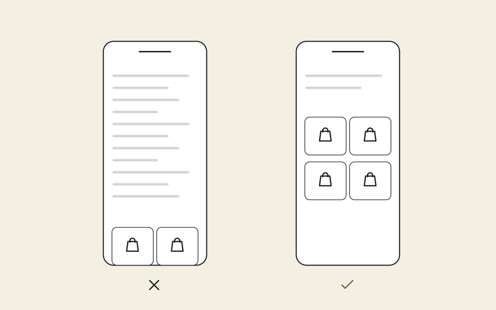
The intro above the grid has one job: confirm the shopper is in the right place and point them towards the right product. It must not push the products below the first screen on mobile.
The intro formula
I keep it to two or three sentences, usually 40 to 70 words: what's in the collection + who it suits + one differentiator + a pointer to help below.
Before and after examples
Beef roasts, before:
Welcome to our beef roasts collection! Browse our amazing range
of premium beef roasts, the best beef roasts online.
Beef roasts, after:
Beef roasts for oven, rotisserie and slow cooking, from 1.5 kg
rolled rumps for a family dinner to whole bone-in ribs for a crowd.
Every roast is vacuum packed and delivered chilled. Not sure which
cut to pick? The roast guide below compares them by size and budget.
Home gym equipment, before:
Shop home gym equipment. Home gym equipment for sale at great
prices. Free shipping on home gym equipment.
Home gym equipment, after:
Space-saving strength and cardio equipment for garages, spare
rooms and apartments. Filter by floor space or budget, or scroll
down for a starter kit list for under 2 square metres.
Each "after" version names the products, the buyer and a reason to keep scrolling. None of them repeats the keyword more than once, and none of them makes a claim the store can't prove.
Intro mistakes I fix most often
- Three paragraphs of brand story above the grid, which pushes products off the first screen.
- The keyword repeated four or five times in one short paragraph.
- Generic text copied across collections with only the product name swapped.
- Hiding the intro in a "show more" toggle that holds most of the content. If it's useful enough to write, show at least the first part.
Put the buying help below the grid
Below the grid is where a collection page earns its depth. Shoppers who scroll past the products are still deciding, so give them the information that helps them choose.
Sections that work below the grid
- How to choose: the two or three factors that matter most, such as size, budget, cooking method or fit.
- A comparison table: the main options side by side, each linking to its product page.
- Use and care basics: short guidance, with a link to a full guide if you have one.
- Related collections: sideways links to sibling collections and down links to narrower ones.
- FAQs: three to six questions from real customer emails, reviews and "People also ask".
Example outline for a "beef roasts" collection
H2  How to choose a beef roast
    - Feeding 4 to 6: rolled rump or topside (1.5 to 2 kg)
    - Feeding 8 to 12: bone-in rib or whole sirloin
    - Slow cooking on a budget: blade or chuck roast
H2  Beef roast cuts compared (table: cut, size, method, serves)
H2  Roasting basics
    - Rest the roast before carving
    - Link: full roasting temperature guide
H2  Related collections
    - Lamb roasts, Pork roasts, Roasting packs
H2  Beef roast FAQs (4 questions from customer emails)
How much text is enough?
As a working range, I write 300 to 800 words below the grid for a major collection, and less for small or simple ones. A collection of three phone cases doesn't need a buying guide. A collection of 40 mattresses does. Let the complexity of the choice decide the length, not a word count target.
Title tags, H1s and meta descriptions for collections
Collections often carry the platform's default title, such as "Roasts – Store Name". That wastes the most important on-page signal. I rewrite titles to match the primary keyword and add a reason to click.
| Element | Before | After |
|---|---|---|
| H1 | Roasts | Beef Roasts |
| Title tag | Roasts – Store Name | Beef Roasts: Buy Roasting Cuts Online | Store Name |
| Meta description | (empty, so Google pulls random text) | Rolled rump, topside and bone-in rib roasts, vacuum packed and delivered chilled. Compare cuts by size and serves before you buy. |
| H1 | Gym | Home Gym Equipment |
| Title tag | Gym – Store Name | Home Gym Equipment for Small Spaces | Store Name |
In Shopify, edit the collection description under Products, then Collections, and set the title tag and meta description in the search engine listing section at the bottom of the collection editor. Test the results in a title and meta preview tool before you publish.
Internal links: the lever most stores ignore
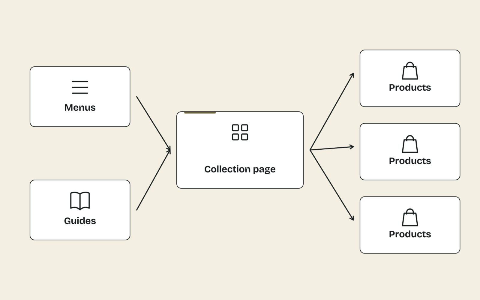
In my experience, internal links move collection rankings more reliably than extra copy does. A collection with five relevant links from guides, the menu and related collections usually outperforms a better-written collection that nothing links to.
Links into the collection
- The main navigation or a clearly labelled sub-menu.
- Blog posts, recipes and buying guides that mention the topic, using a descriptive anchor such as "rolled rump roasts".
- Product pages, through breadcrumbs and a "more from this collection" link.
- Parent collections linking down to narrower ones.
Links out of the collection
- Every product you want indexed, through crawlable
<a href>links rather than JavaScript-only buttons. - Sibling collections and the most useful buying guide.
On Cost Cut Meats, I took orphan pages from 45 to 0 and grew internal links from 621 to 750, with each anchor phrase pointing to one page only. That last rule matters for collections: if "beef roasts" links to three different pages across the site, you're telling Google three pages compete for the term. On Shopify, the same principles apply with a few platform quirks, which I cover in Shopify internal linking.
Filters, pagination, empty and thin collections

Technical problems on collection pages can waste crawl attention and create hundreds of near-duplicate URLs. These are the decisions I make on every store, adjusted for its platform and size.
| Situation | What I do |
|---|---|
| Paginated collection (page 2, 3, 4) | Each page gets its own URL (such as ?page=2) and its own canonical, linked with normal <a href> links |
| Sort orders (price, newest) | Keep out of the index with noindex, or discourage crawling in robots.txt |
| Filter combinations with no search demand | Keep out of the index; let shoppers use them freely |
| Filter combination with real search demand | Turn it into a proper collection with its own content and links |
| Empty collection, permanently | 301 redirect to the closest live collection or product |
| Empty collection, seasonal | Keep live with a note on when stock returns and links to alternatives |
| Thin collection (one or two products) | Merge into the parent collection, or grow the range before investing in content |
The pagination rules come straight from Google's guidance on pagination and incremental loading: don't canonicalise page 2 to page 1, use crawlable links rather than "load more" buttons alone, and keep sort and filter variations out of the index if you don't want them there.
For empty collections, on Cost Cut Meats I redirected 9 empty collections (301) to the closest live page. An empty grid is a dead end for a shopper, while a redirect sends both people and the old URL's links to a page that can actually sell.
Structured data on collection pages
Collection pages need less markup than many plugins add. My default is BreadcrumbList, which describes where the page sits in the site, plus the Organization markup your theme already outputs site-wide.
I don't rely on ItemList markup for product collections. Google's carousel rich result supports ItemList only for courses, movies, recipes and restaurants, so it won't produce a product carousel for your collection. Product markup belongs on the product pages, where the price and stock for one item are shown.
If you advertise or list products in Google Shopping, your collection structure can also inform the product_type attribute in your feed. That keeps your Shopping reporting organised the same way as your site, and it's one of the routine tidy-ups I do when cleaning up a Merchant Center feed.
Make it convert, then measure it
A collection page that ranks but doesn't lead to product clicks isn't finished. Check the basics that turn browsers into buyers before you call the content done.
- Products visible on the first mobile screen, with price and a key fact (weight, size) on each card.
- Filters that match how people choose: by size, price, use, not by internal category codes.
- Sensible default sorting, usually best sellers first rather than newest.
- Delivery and returns basics visible near the top or on each card.
If those are in place and the page still loses people, structured testing through conversion rate optimisation work will tell you which change matters, rather than guessing.
How I measure collection content
- In Search Console, open Performance, then Search results, and filter by the collection URL. Note clicks, impressions, CTR and average position for the 28 days before the change.
- Publish, request indexing with URL Inspection, and wait at least 4 weeks.
- Compare the same metrics for the 28 days after, allowing for seasonality and sales.
- In GA4 or Shopify analytics, compare the collection's click-through to product pages and its contribution to sales.
Start with collections that already have impressions and an average position between about 8 and 20. They're close enough to page one that better content and links can make a visible difference.
The bottom line
Help people choose, then get out of the way. A short intro, a visible grid and practical buying help below it will do more than any amount of keyword-heavy copy.
Map one keyword to each collection, link to it from the places that matter, and tidy up the empty and filtered pages around it.
If you want your key collections planned and written properly, my eCommerce content writing service covers the keyword mapping, copy and internal links together.
FAQs
1. Does text below the product grid help SEO?
Yes, as long as it's visible, useful and specific to that collection. Text below the grid can explain how to choose, compare options and answer common questions without pushing products down the page.
2. How long should a collection page description be?
Keep the intro above the grid to two or three sentences. Below the grid, 300 to 800 words is a sensible range for a major collection with many similar products, and much less for small or simple collections.
3. Should every collection page have content?
No. Start with collections that already get impressions or sales and that target a keyword people search. Seasonal, promotional or very small collections can stay light, or be kept out of the index.
4. What is the difference between a category page and a collection page?
They're the same thing under different names. Shopify calls them collections, while WooCommerce and most other platforms call them categories. The SEO approach is the same.
5. Should I noindex filtered collection pages?
Usually, yes, for filter and sort combinations nobody searches for, because they create many near-duplicate URLs. If a filter combination has real search demand, turn it into its own collection with unique content instead.
6. What should I do with empty collections?
If the collection won't be restocked, 301 redirect it to the closest live collection or product. If it's seasonal, keep it live with a note on when stock returns and links to alternatives.